


For general feedback about the game.
Steam SupportVisit the support site for any issues you may be having with the game or Steam.
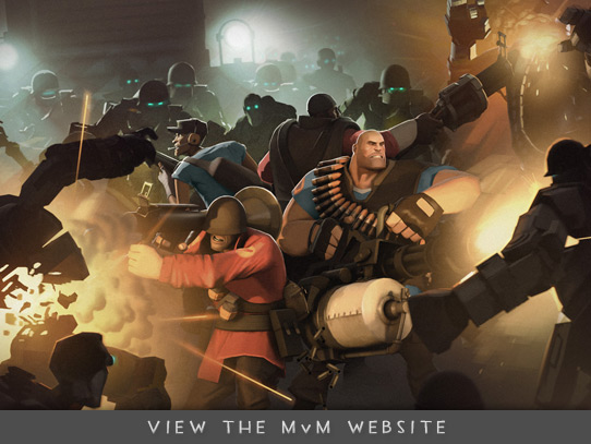
Have you seen the movie Alien? Remember how tough that alien was? Well, imagine if there was a version of Alien but with like hundreds of aliens. One: That would be a great movie that we now own the idea for. Two: The impossible odds of that situation pretty accurately describe the trouble you’re in for when that carrier opens on Wednesday and Gray Mann’s robot army pours out. Luckily, we solved the enormous plot hole that would have plagued our currently-in-production Alien sequel by offering MvM’s plucky heroes a whole mess of deadly upgrades for their weapons, items and abilities, which you can read about here.
We’re also unveiling a new museum-themed map called Coal Town. It features many informative placards about the fascinating details of life in a turn-of-the-century mining community, which you can read when you’re lying on the ground holding your own guts in while a robot stomps on your neck.
This is Saxton. Hale! And that legion business in the title was a Bible quote to let you know how serious this all is: Bible serious. So listen up, mercs. Some puny cowards built an army of robots to fight his fights for him. I don't know if robots have human emotions, but if not, they’re doing a Saxxy-worthy impression of them, because they look mad. Also, Reddy tells me they’re heading straight at Mann Co.
So there's a big fight coming, and I'm going to need you mercs to fight it for me. Not for coward reasons, though. Fight reasons. I got a different fight going and I can't fight both fights at once. Well, I could, but the fights are on different continents.
Boyohboy. If you're like me, reading the word "fight" this much has got you in the mood to fight. Last thing you probably want to do right now is read. Unfortunately, Bidwell wrote a stupid report on all the heavy hitters you’ll be running into out there. If I was you I’d skip it.
Alright, enough reading advice. It's man-to-man talk time. I am not going to lie to you: I am going to have to lie to you. You men are absolutely prepared to deal with this, and you are going to be just fine. Right. End of lie. Now get ready to absorb some bullets so they don’t hit my factories.
We have 48 hours until robots arrive. Get moving.
Last night we launched our most fiendishly difficult ARG yet, involving roughly 5000 individual pieces of data that had to be painstakingly collected and decoded by equipping specific items and then performing even more specific actions in-game. It was diabolically, even needlessly complex, and there was some concern among the TF team that this time we might have gone a little overboard. It would take the community weeks to sort through this, we worried.
We shouldn't have. In just twelve hours, the master-class code breakers in the community put their collective brainpower to the puzzle and cracked it wide open, uncovering a mysterious link at 2:46AM PDT this morning that promised a small taste of things to come in TF2. We couldn't be more proud of you guys. Also, if we're being honest, a little giddy at the possibilities, because if you can apply yourselves this commandingly to a goofy online puzzle for a war-themed hat simulator, next time we'll think big and ask you to construct a manned space shuttle to Mars or something.
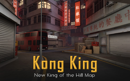
Were you thinking, "I really like playing TF2, but I wish there was a King of the Hill map set in a Chinese cityscape"? Well, your oddly specific and scarily prescient dreams have come true! Introducing Kong King - TF2’s first city-themed map! - created in collaboration with Sleeping Dogs and community member Valentin Levillain, aka 3Dnj.
We’re a little disappointed that Valentin is spending all of his time making TF2 maps and not fulfilling his true destiny as a roguishly handsome super-villain, but it gives us a chance to finish our costumes for our inevitable battle atop a snowy mountain where we will fight for the love of Cassandra Prosciutto.
You may be able to capture her physical form with your hyper-advanced laser-traps, Levillain, but you will never capture…her heart!
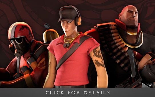
Interesting China Fact: Did you know China has a mafia? Did you know that, not only do they exist, they'll loan you money? And not even a little -- as much as you want! We hadn't even heard of them until last week, and now we're treating them like a cash machine. Seriously, these guys are nice. They've even started calling us all the time now, probably to ask how we're getting along with all that free money they gave us.
Anyway, the Chinese Mafia made their own game, Sleeping Dogs, so we've added some all-new items to TF in honor of our new best friends. Also, if anyone's seen Robin Walker, tell him somebody mailed us his hand, because he's probably looking for it.
Introducing eight new items available in the Mann Co. Store, or FREE when you pre-purchase Sleeping Dogs on Steam.