

For general feedback about the game.
Steam SupportVisit the support site for any issues you may be having with the game or Steam.
One of the things we're looking at for the next update is the creation of a new type of environment for our levels to be built in. We're pretty happy with the way our environments have turned out so far, but as we create more and more maps with these achievement packs, we want our level designers to have more to work with in terms of giving their settings a unique look.
The challenging part of this type of design process is in finding types of terrain and structures that provide an understandable, interesting set of visuals and at the same time staying within the constraints of what we want to do with gameplay. In addition to this, we want to be able to stay within the strengths of the engine that TF is built around.


In coming up with these ideas, we have a set of questions we ask about each one, for example:
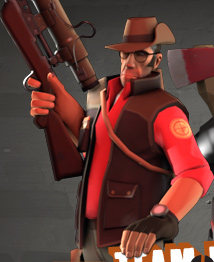
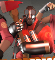
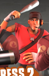
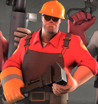
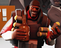
For this week's update, we've got another set of trading card images to take a look at. The focus of our most recent achievement update, the Pyro is a character that players may have seen a lot of lately - making life a nightmare inferno for both the Spy and Medic.


One of the things we hope to do on this blog is to point out the creative things that members of the TF2 community are up to. The Steampowered TF2 forum members have been collecting links ever since TF2 was released, and you can take a look at the list (and its accompanying 46-pages-so-far (!) forum thread) here.

Recently, we've received a ton of email asking us if we had accidentally leaked the details of the Spy's unlockables, after Kaanin created this fake web page detailing his version of what the release should contain. His mocked-up image was convincing enough that even some of us at Valve were momentarily fooled. Well played, Kaanin.
Well, we were expecting some response to A Heavy Problem, but we severely underestimated just how much interest everyone had in contributing. If you're one of the many folks who emailed us proposals and haven't received a response, please accept our apologies, because there's just too many for us to reply to all of them. From the large amount of feedback and forum activity, it's clear that many of you found this interesting, so we'll definitely be posting more design goals. For those of you still thinking about it, here are some more tools to use in evaluating ideas:
The last one raises another question: What other goals should we have for the Heavy update? Half the battle of good design is choosing the right goals and the right constraints. In A Heavy Problem, we specified a goal for you, and the constraints that had to be kept in mind. Try taking a shot at defining the overall set of goals that the Heavy unlockables should be trying to achieve. Watch out for the common circular logic trap of finding an idea you like and then trying to extract goals from it. We find it's best to not think about ideas at all at this point, and to focus entirely on more abstract goals. What are the biggest problems in the Heavy class? In what situations is it the least fun? Like idea evaluation, goal generation is a big topic in itself, and one we'll go into in a later post.
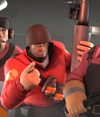
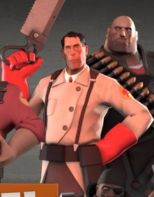
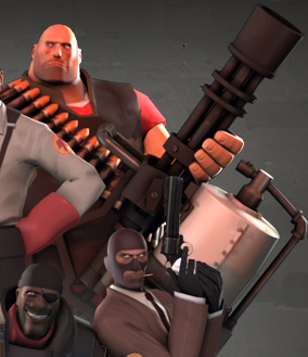
To continue from the previous week, today we have some additional finished trading card images for you to take a look at - the Heavy and the Medic.


